TheCrossdresser.com Gets Better with Age
I was just doing some more design work on TheCrossdresser.com and started thinking about all theĂ‚Â changes I’ve made to the site over the years . . . and if my design doesn’t look professional today, how amazingly bad it looked when I first started. I mean, never mind that the first version was just a yahoo group (which still exists, by the way – AmateurCrossdressingPhotos).
Anyway, I dug through my files and found some pics of my old site layouts so I thought I’d share them . . . maybe against my better judgement ![]()
 All I could find of the very first design was this photo that happened to include it in the background. Photo is actually part of one of my sets, where I was pretending to be working on the site
 ![]() But anywho . . . this wasn’t actually the very first design since there’s graphical button links . . . but it’s as close as I can find. Notice that I couldn’t figure out how to make my border continue all the way around, so it just stops in the title. I did actually manage to erase some of the background from the photos in this version though so it almost looks like they’re part of the site layout instead of random photos . . .
But anywho . . . this wasn’t actually the very first design since there’s graphical button links . . . but it’s as close as I can find. Notice that I couldn’t figure out how to make my border continue all the way around, so it just stops in the title. I did actually manage to erase some of the background from the photos in this version though so it almost looks like they’re part of the site layout instead of random photos . . .
 I started to get fancy on this layout . . . I learned a little more about Dreamweaver and just updated everything, so now there’s a continuous border. And I played with Photoshop a bit more and managed to erase a good bit of the background from the layout photos . . . but notice all the photos have big black areas because that was the only way I could get them to blend into my black background!
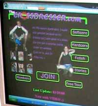
 Now this is not a version of the site I’m proud of . . . as evidenced by the fact that the only image found of it came from an outdated third party review’s screen capture of the members’ area that they still have posted . . . but that’s another subject. Anyway, the tour pages didn’t look quite this bad (I don’t think), but I really have no excuse for re-using the old title banner in a new color scheme. Believe it or not though, this design was a huge improvement in site navigation. Plus I figured out how to get images on the right side of a text block. I still couldn’t get all the background erased from the images in Photoshop though . . . oh well, one step at a time, right?
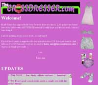
 Which brings us to a familiar image, the current site design. I’m still fond of this one (introduced in 2007), and I put in a TON of work on it. Not the least of which was (finally) finding a reasonable color scheme. Which is easier said than done, considering that I’m colorblind. Though I don’t think even colorblindness is much of an excuse for some of the original designs. Of course, this layout’s already a bit outdated – I learned an amazing amount this year about how to use Photoshop (and Illustrator) the right way . . . when I did this layout I still couldn’t figure out how to get images in the background that looked natural, and I didn’t know the right compression settings to get the site exported with reasonable file sizes . . . and I didn’t know how to use slices, so I hand cut, saved, compressed, and re-aligned all the pieces. Eek! And of course by the time I did all that I decided I wasn’t going to go back and fix the small issues because it would mean hand re-building everything again!
 Well I’m not ready to give up on the above design, but I did end up putting together a 2008 version which I’m currently using as an alternate tour. This one needs a little tweaking still, but at least the files are set up so that I can do it! Anyway, I like it, but it’s not as clean as the above design either. Maybe they’ll just attract different types of people though
 ![]()
Leave a Reply